 Most powerpoint visuals are benign charts, graphs and bulleted lists of nonsense that wallpaper over the true story behind the presentation. I just received this terrific infographic on the power of infographics: visual storytelling.
It it’s true that 50% of your brain is involved in visual processing. And 70% of all your sensory receptors are in your eyes. AND you can get the sense of a visual scene in less than 1/10 of a second. Then why does everybody litter their presentations with the meaning-blurring cataracts of stats and facts without giving them the emotional context found in metaphorical visuals accentuated by storytelling?
Here are the 8 reasons why information conveyed through powerfully designed visuals make your stories crystal clear.
- The use of visualized information has dramatically increased in books, on the web and in newspapers
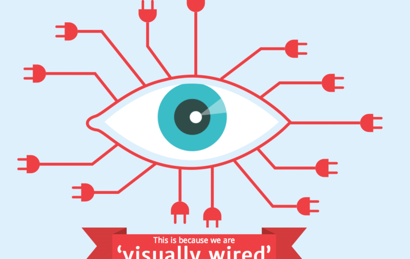
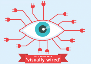
- We are visually wired: It only takes us 150 milliseconds for a symbol to be processed and just 100 milliseconds to attach a meaning to it.
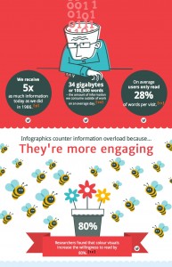
- Visual information helps us combat information overload: We receive five times as much information today as we did in 1986.
- Well-thought out and designed visuals are simply more engaging than charts and graphs. They caress our emotional right brain without taxing our analytical left brain.
- Communicating information through beautiful graphics helped people follow directions 323% better than directions without illustrations.
- A study at Wharton School of Business found that presentations with visuals were 17% more persuasive than those without.
- Infographics and visuals that tell a story are easier for the human mind to recall. People remember 10% of what they hear, 20% of what they read, and 80% of what they see and do.
- Infographics, when they are particularly well designed, are easy to digest, fun to share and extremely engaging.
Although the above bulleted list of stats and facts about the power of visual storytelling is interesting, it’s not very engaging. Experience how it is brought to life in this info graphic that informs the content of this post. Thanks, NeoMam Studios for sharing your insights.


at 4:18 pm
Love Love Love the concept of infusing storytelling into learning! When you can connect the dots for learners via a story the retention is simply higher! Love your post and thanks for consolidating some great research and thoughts! I found your article on http://www.learningrush.com and I am glad I did!
Kerri Simmons
at 10:11 am
Thank you for your note, Kerri. I’ve been reading some very interesting brain research on visual storytelling that goes hand-in-hand with this post. I’ll publish those sources next week, in case you’re interested.
at 5:01 am
[…] the efficacy of visual storytelling. On the rate of information intake, Howell calls us “visually wired,” able to process a symbol in just 150 milliseconds. Moreover, it takes a mere 100 […]
at 4:15 am
[…] primal act of human nature. In the conditions of information overload where we constantly soak up five-times more information daily than our counterparts did back in 1986, it is crucial for brands to stand out and grip the […]
at 5:53 am
[…] primal act of human nature. In the conditions of information overload where we constantly soak up five-times more information daily than our counterparts did back in 1986, it is crucial for brands to stand out and grip the […]
at 11:28 pm
[…] primal act of human nature. Within the circumstances of data overload the place we always take in five-times extra data day by day than our counterparts did again in 1986, it’s essential for manufacturers to face […]
at 2:50 am
[…] natura umana. Nelle condizioni di sovraccarico di informazioni in cui assorbiamo costantemente cinque volte più informazioni al giorno rispetto alle nostre controparti nel 1986, è fondamentale che i marchi si distinguano e […]