As you race toward the intersection, the green light suddenly flips to yellow. How long do you have? Do you nudge the brakes? Or do you run it?
We’ve all been there. And we’ve all taken that awful risk thinking we can make it. Our irrational sense of wasting time pushes the pedal of adrenaline that over-rides our common sense for safety. This all takes place in a fraction of a second; a blink of an eye that has us careening through an intersection under a bright red light. And at what cost?
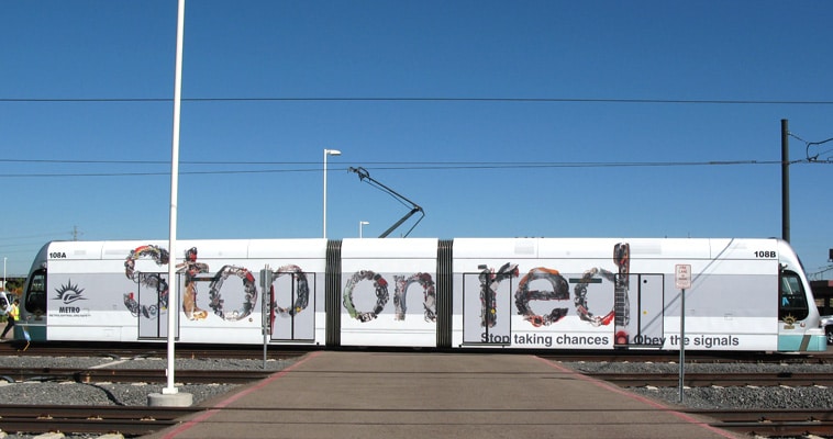
This is the story found in each letter of the new “Stop on Red” campaign we just launched for Phoenix Metro Light Rail. The font is made up with the twisted car parts, and the hauntingly injured personal items, found in the aftermath of a red light runner who didn’t quite make it.
A campaign designed to make you stop. And think.
We started by projecting Helvetica letters onto large white sheets of butcher paper, and then tracing the outlines.
In stifling 110 plus degree Arizona summer heat, we scoured junk yards and staged the car parts and pieces back at the Park&Co campus.
We raised scaffolding for the photographer in our creative garage, placed the first large Helvetica-traced letter on the ground, and began to meticulous create our font from our junkyard stuff.
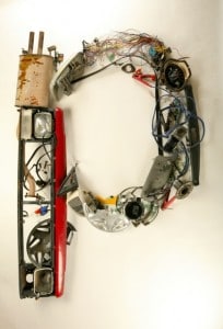 Each letter was photographed and polished in photoshop to make the items as clear as possible. The final artwork featured 6-foot-tall words with the fractured items within life size. So when you stop to examine each letter, you find a mangled steering wheel, shattered head lights, tangled bumpers and dented quarter panels. Strewn among the carnage are even more telling items: A smashed iPod, a scuffed doll, broken sunglasses, a high heel, a child’s hair braid, and other personal effects that tell a more poignant story.
So the next time you find yourself accelerating toward a stale green light, think of what kind a consequence your actions may spell for you and that complete stranger you’re about to meet.




at 9:12 am
This campaign is about as creative as it gets. I was lucky enough to get a tour of Park & Co. when they were shooting some stills. Being a photography buff and a marketing geek – I was blown away.
Great stuff Park. Kudos to you and your creative team!
at 11:39 am
Powerful! This campaign has legs, Park! What if you did the whole alphabet? Maybe you could get schools to create their own message with them.
at 2:16 pm
What a cool idea, Angelo. We should’ve thought of that when during our two-day shoot. Now we only have 20 more letters to go.
Thanks for your note.
at 9:49 am
[…] We had the guts to take a bold and peculiar approach to launch the rail line’s “Stop on Red” campaign. […]
at 10:17 am
[…] personal items you might find at traffic accidents to draw attention to Metro Light Rail’s “Stop on Red” campaign: Bronze […]